
Consider the world outside horology for a moment. Nike’s swoosh is instantly recognisable. Globally, it speaks to achievement, motion, and aspiration. Its meaning comes less from complexity and more from repeated association; its power is psychological rather than intricate. In watchmaking, Rolex performs a similar trick. The coronet—five golden points arranged like a miniature royal palm—shouts authority, prestige, and legacy. It’s declarative. It doesn’t hide. It doesn’t whisper. It asserts. Whether you adore the modern Rolex market or quietly resent its inflated hype, it is impossible to deny the potency of that crown. It’s a visual shorthand: as soon as you see it, you understand what it signifies, both socially and emotionally, as well as financially. That’s the genius of logos that declares—they remove ambiguity.
And then, there are logos that whisper. They invite closer inspection, reward curiosity, and only reveal their depth after a moment of reflection. Take FedEx outside the watch world. At first glance, it’s bold, clean typography. But peer into the negative space between the “E” and the “x,” and an arrow appears, sleek and deliberate. Speed. Precision. Direction. Subtlety. Elegance. You notice it once, and you can never unsee it. That’s the intention at work. That’s a conversation between creator and observer, a quiet dialogue that occurs without a single word. And yet, this kind of thinking—embedding hidden meaning in design—is surprisingly rare in watchmaking. Most logos don’t bother. Most simply exist as surface markers, identifying the object without adding narrative or insight.
Think Omega. The iconic Greek letter Omega is immediately recognisable, circular yet assertive, evoking continuity, perfection, and precision. It is elegant in its simplicity, almost mathematical in its restraint. But while it signals technical excellence and historical resonance, it carries little beyond that immediate association. Panerai, by contrast, employs its clean sandwich-dial typography and minimalist emblem to suggest functionality, historical depth, and Italian military heritage—but it does so quietly, without flourish. Cartier’s double-C monogram is decorative yet elegant, conveying luxury and heritage in equal measure. Lange & Söhne’s typographic minimalism demonstrates that even a simple set of proportional letters, devoid of devices or symbols, can convey DNA, confidence, and authority. These examples highlight a spectrum of approaches: some logos declare, others whisper, and some rely on a history of repeated association to gain meaning.
Then there is Rolex. Again, it deserves attention precisely because it illustrates the limits of subtlety. The coronet doesn’t whisper. It does not suggest. It shouts. It claims the wrist, the market, and the imagination. Compare that to Patek Philippe, whose Calatrava cross is understated, centuries old, and refined into a mark of elegance and restraint. But the brand’s true emotional resonance does not reside in the cross. It exists in a sentence: “You never actually own a Patek Philippe. You merely look after it for the next generation.” Here, the emblem anchors the narrative, but it is the philosophy—encoded in words, history, and cultural narrative—that carries the weight. This is a subtle, yet vital distinction: a logo alone can mark an object, but it is intention, context, and narrative that transform it into meaningful content.
Sometimes, logos are deliberately provocative or polarising. Consider Phobos, with its octopus’ emblem. It is intricate, unusual, and almost alien in its approach. Some collectors adore it; others recoil. Yet, whether one loves or hates it, the emblem communicates something important: audacity, risk-taking, and refusal to conform. In a sea of Helvetica-on-dial anonymity, such a design leaves a lasting impression. It is memorable not because it is universally appealing, but because it is unapologetically distinctive. In horology, memorability often trumps perfection because a visual signature that sparks curiosity or emotion achieves the deeper purpose of connecting the maker and the observer.
Even typographic choices carry weight. Lange & Söhne’s restrained, proportional lettering communicates the brand’s DNA without any ornamental flourish. The restraint itself signals confidence and authority. It is the quiet counterpoint to the shouting logos of Rolex or the playful complexity of Phobos. Omega’s clean glyph conveys precision; Breitling’s winged emblem speaks to flight and heritage. Each example demonstrates how intention, context, and audience shape reception. The best logos do more than identify—they encode values, history, and philosophy into form.
Independent watchmaking offers yet another layer. Here, logos often carry deeply personal narratives. They are designed with philosophical intent, reflecting mission and purpose. And sometimes, they reveal the invisible—emotions, causes, or personal stories distilled into form. For instance, consider the emblem of a small but meticulously conceived brand. At first glance, it may appear minimal, austere, even geometric. Yet within negative spaces, hidden elements speak to mission: ribbons for awareness, mirrored characters for balance and duality, subtle cues that reward observation. These logos are not meant for instant gratification; they are puzzles, whispers, and personal statements. They invite engagement, reward curiosity, and reveal layers over repeated encounters.

This is the quiet power of design in horology. A logo, when crafted with intention, becomes more than decoration. It becomes a conversation, a story, a meditation. It can reward attention, spark reflection, and communicate philosophy. When we encounter these emblems—whether declarative or whispering, historical or audacious—we are engaging with the watchmaker’s mindset as much as their craft. We are reading a signature, a fingerprint, an encoded message from someone who cared not just about the mechanics of time, but about the human experience of observing it.
As enthusiasts, we are encouraged to look deeper. To examine the crowns, the dials, and the clasps. To ask why a logo exists, why it was shaped that way, and what it intends to communicate. Some logos do nothing beyond identification. Some hint at history or function. Others, rare as they are, carry intention, philosophy, and emotion simultaneously. And those rare logos—those that reward attention and reflection—are often the most satisfying to discover, the most compelling to study, and the most memorable to live with. <!—nextpage—>
As we continue our journey into logos, we will delve into the hidden layers and personal meaning embedded in independent watchmaking, examining logos that convey philosophy, purpose, and subtle narratives, and uncovering how some of the world’s most thoughtful brands encode emotion into geometry and typography and the hidden layers, and intention in Independent Watchmaking
Independent watchmaking has always offered something the mainstream cannot: freedom. Freedom to experiment, freedom to express, freedom to embed story and purpose into every detail. Within this space, logos take on a different dimension. They are no longer mere marks of identification or historical homage—they become vessels of philosophy, intent, and narrative. They carry the DNA of a brand’s mission, the heartbeat of its founder’s vision, and sometimes, a whisper of personal meaning that can be invisible to all but the attentive observer.
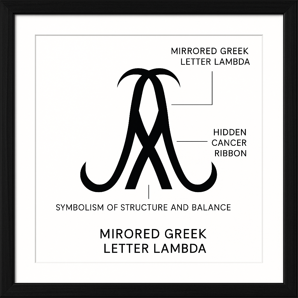
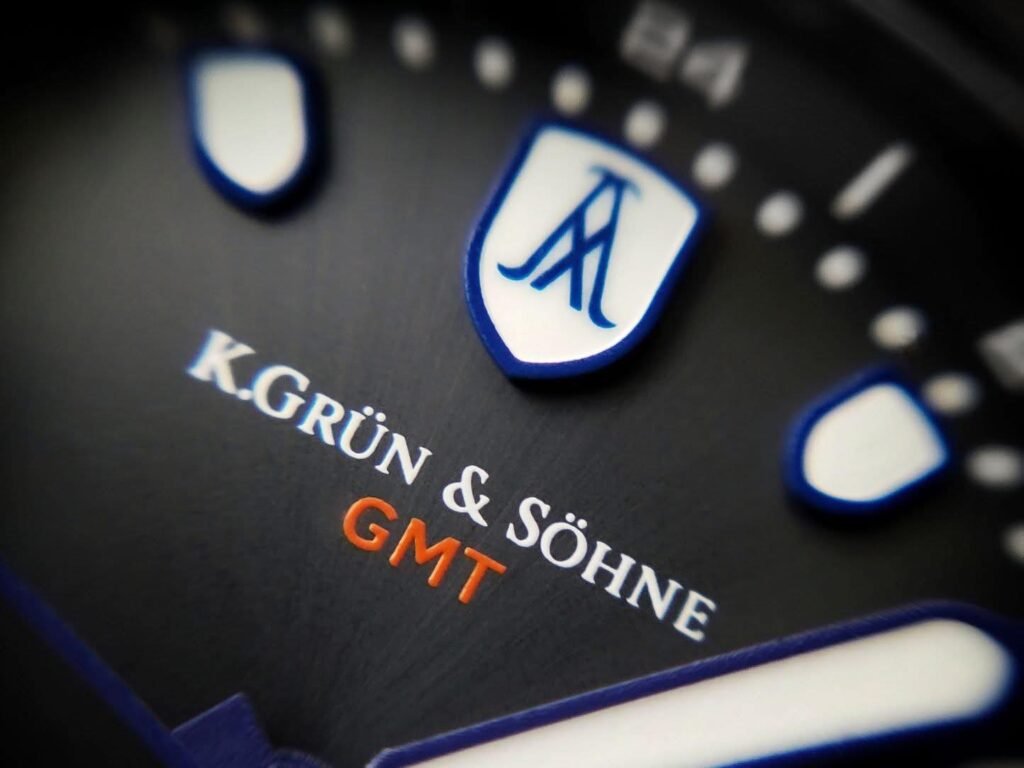
Take the emblem of K Grün & Söhne as a case study—not because it is the only brand to achieve this, but because its conception illuminates the power of thoughtful design. To the uninitiated, the KG&S logo might appear severe, minimal, and geometric. Some have even joked it resembles an oil derrick—a critique that reveals more about the viewer than the designer. But a closer look rewards patience. At its core lies a mirrored Greek letter lambda. Lambda is a symbol rich with associations: balance, wavelength, transformation, and precision. Mirrored, it suggests duality, symmetry, and unity. Within this structure, subtly hidden in the negative space, is a ribbon —the universal emblem of cancer awareness. It is not highlighted, not framed, not announced. Yet it exists, silently communicating the brand’s raison d’être.
The design process behind such a logo is painstaking. This was not the product of an afternoon sketch. Eight months of iteration, of drawing, redrawing, questioning, and sleepless reflection went into every angle, every line, every curve. There is a delicate tension in this work: too literal and it becomes obvious, almost cloying; too abstract and it risks invisibility. The goal is that moment when the design clicks—when aesthetics and emotion converge. The logo then serves as both an identifier and a storyteller. It carries grief without morbidity, purpose without pretension, elegance without artifice. It is geometry imbued with humanity, subtlety infused with conviction.
This kind of intentionality is rare in watchmaking. Many independent brands fall back on historical motifs, stylised initials, Latin phrases, or pseudo-heraldic devices. There is nothing inherently wrong with these choices—they can communicate heritage, craftsmanship, or technical seriousness—but they rarely carry emotional weight or personal story. For a logo to transcend its surface, it must embed narrative, philosophy, or mission into form. It must invite engagement, reward curiosity, and spark reflection. It must be something the observer discovers rather than passively absorbs.
The contrast between declarative and subtle logos is fascinating in this space. Breitling’s wings, for instance, declare heritage, aviation, and technical prowess. But the message is fixed, historical, and somewhat nostalgic in its modern iteration. By contrast, a logo like KG&S operates on multiple layers simultaneously. It is both formal and human, architectural and emotional. It signals seriousness while concealing intimacy. It communicates the mission while maintaining visual balance and aesthetic appeal. This is the power of layered intention: the logo is not merely a mark; it is an interface between creator and audience, offering depth for those willing to look closely.
It is not only independent brands that benefit from subtlety and layered meaning, but they are uniquely positioned to exploit it. Without the constraints of mass marketing, without the pressure to appeal to every collector or investor, independent watchmakers can afford to take risks. They can embed personal stories, philosophical ideas, or social missions into their design. They can create logos that function almost as visual poetry, rewarding study and contemplation rather than instant recognition alone. This freedom is precisely why some independent logos resonate far beyond their size or market presence.
Other notable independents follow similar philosophies, albeit in different ways. Kari Voutilainen’s script is instantly recognisable and carries artisanal authority without embellishment. His mark is minimal but exudes the subtle confidence of decades of mastery. MB&F, on the other hand, leverages almost emblematic forms that signal audacious creativity, movement architecture, and kinetic play. These are not conventional logos, and they do not need to be. Their purpose is not to announce, but to intrigue, to hint at complexity, to reward curiosity.
Contrast this with brands that rely solely on historical gravitas or aesthetic clichés. There is nothing inherently wrong with the use of wings, shields, or compasses. But without layered intention, they risk becoming visual noise. The observer reads them as familiar patterns, not as meaningful communication. Logos that hide purpose, intention, or narrative are those that linger in memory. Logos that exist solely as decorative shorthand do not. This is why independent watch logos often become far more memorable than their mainstream counterparts despite limited visibility—they carry the weight of human intention, philosophy, and narrative.
KG&S is an example that combines personal mission with aesthetic rigour. The hidden ribbon is more than symbolic—it is a philosophical anchor. It communicates purpose, resilience, and continuity without ever being obtrusive. The mirrored lambda structure communicates balance, duality, and reflection. The composition functions not just as an emblem, but as a visual essay, quietly asserting that a watch can carry a message beyond the mechanics of its movement. This is emotional geometry in action: form and feeling are intertwined, purpose is encoded in structure, and narrative is embedded in negative space.
And yet, this subtlety is a risk. Many observers miss the hidden ribbon entirely. Some dismiss the emblem as stark or severe, seeing only the abstract geometry. But that is the point: logos like this are not for casual glance. They reward attention, reflection, and curiosity. They create a sense of discovery, a secret understood by those who care to look. In this sense, the logo becomes a conversation between maker and wearer, bridging emotional and philosophical spaces that most brands never attempt to do.
This is the quiet genius of intentional design in independent watchmaking: it demonstrates that branding can be personal, narrative-driven, and emotionally resonant without needing to shout. A logo can be understated, minimal, and even austere, yet carry profound meaning. It can encode grief, purpose, balance, or hope. It can serve as both identifier and storyteller, philosophy and decoration, function and meditation. This is the invisible work of the designer, the hidden labour of intention, the meticulous threading of story into form.
The landscape of watch logos is as varied as the watches themselves. Across the centuries, some brands have managed to craft emblems that are instantly recognisable, deeply symbolic, and emotionally resonant. Others, despite technical brilliance, fall flat visually, or work only within a narrow context. Examining these logos—what they communicate, how they adapt, and where they falter—offers insight into the delicate art of visual identity in the horology industry.
Take Omega, for instance. Its iconic Greek letter, Ω, is elegant, instantly recognisable, and loaded with historical and mathematical significance. It evokes notions of perfection, completion, and endurance. And yet, the logo functions most powerfully when paired with the narrative of Omega’s watches: the Speedmaster’s association with space exploration, the Seamaster’s maritime prowess, and the brand’s enduring technical credibility. Without these stories, the Omega symbol is strong, but it relies on context to achieve full resonance. In isolation, it communicates stability and precision, but it is the intersection of emblem and narrative that gives it emotional depth.
Panerai offers another example of context-bound identity. The sandwich dial, minimalistic typography, and understated emblem speak to Italian military heritage, legibility, and tool-watch seriousness. But transplant this logo onto a dress watch or a hyper-technical tourbillon, and it feels incongruous. Its power is tied to a specific design philosophy and history. This illustrates an important point: a logo’s meaning is not absolute; it is inseparable from product, narrative, and market positioning.
Cartier, by contrast, demonstrates elegance and adaptability. The double-C monogram is decorative, yes, but it transcends decoration through refinement. It conveys luxury, heritage, and stylistic sophistication, regardless of the specific watch model. The emblem communicates an ethos rather than a narrative bound to a particular instrument. Similarly, A. Lange & Söhne relies on typographic restraint rather than symbolic devices. Its lettering conveys authority, tradition, and mechanical seriousness without needing context, because the brand’s values are already embedded in the font itself.
Some logos are memorable precisely because of their audacity or novelty. Phobos’s octopus, for example, defies traditional horological iconography. It is intricate, unusual, and immediately polarising. Some collectors adore it; others recoil. Yet, in its refusal to conform, it communicates purpose: risk-taking, innovation, and audacious individuality. In a sea of Helvetica-on-dial anonymity, such a logo is not just noticed—it is remembered. It signals that the brand will not play it safe, that it will challenge expectations, and that its watches are experiences as much as they are instruments.
Context can also reveal limitations. Ocean Crawler, a modern diver’s watch brand, has a name and emblem perfectly suited to its niche. It evokes exploration, endurance, and aquatic adventure. The design fits the product, and the narrative is clear. But try adapting that emblem to a dress watch, a formal complication, or a high-end luxury narrative, and the coherence collapses. Its specificity is both its strength and its constraint. By contrast, consider the deliberately ludicrous branding of Octopus Energy. The name is playful, absurd even, yet immediately memorable. It demonstrates that, outside horology, audacity and memorability can trump strict aesthetic coherence. In watchmaking, achieving a similar balance—memorable yet adaptable—is far more challenging because expectations surrounding tradition, sophistication, and technical credibility are exceptionally high.
Breitling’s winged emblem is another instructive case. It clearly signals aviation heritage, mechanical reliability, and the romance of flight. However, as the brand has shifted toward lifestyle-focused marketing, the wings now feel more nostalgic than contemporary and authentic. They are a reminder of past identity rather than an active reflection of current purpose. Tudor’s shield, conversely, functions both as a heraldic device and a signal of technical robustness, bridging heritage and contemporary credibility in a single symbol. Yet, even here, subtlety is critical: the emblem must strike a balance between historical reference, legibility, and modernity. Too much leaning on history risks irrelevance; too much abstraction risks losing recognition.
Hamilton’s stylised “H” is clean, adaptable, and versatile. It carries sufficient gravitas to communicate precision and history, yet can also transition into casual or lifestyle contexts. The success lies in its neutrality: it is flexible enough to function across watches, media, and narrative shifts. Similarly, Seiko’s minimalist “S” emblem communicates technical seriousness and Japanese precision while remaining legible and flexible across diverse product lines—from dive watches to dress watches.
Compare these mainstream examples with those of independent makers, whose logos often convey layered narrative meaning. MB&F, for instance, eschews a conventional emblem entirely. Its designs and mechanical creativity are the brand’s signature; the “logo” is embedded in the kinetic art of the movement itself. Kari Voutilainen’s calligraphic mark serves as both a signature and an emblem, reflecting artisanal identity, personal craftsmanship, and the continuity of tradition. These independent logos operate less as declarative statements and more as invitations to observe, interpret, and engage.
Finally, there is K Grün & Söhne. Its emblem synthesises personal mission, geometric precision, and narrative intent. The mirrored lambda symbolises balance, duality, and harmony; the hidden ribbon represents cancer awareness; the overall composition exhibits structural and aesthetic discipline. Unlike mainstream logos that rely on repetition or context to gain meaning, this emblem carries intrinsic significance. It rewards attention and reflection. It is not immediately obvious, nor should it be. It is designed for those willing to look closely, to engage, to understand the story beneath the surface.
This comparison highlights a broader truth: logos succeed when they strike a balance between clarity, narrative, adaptability, and emotional resonance. Those that are overly literal risk banality; those that are purely decorative risk forgetting their communicative potential. Logos that thrive—whether mainstream or independent—do so because they anchor identity, carry history, reward observation, or embed mission. The best logos, in other words, are multidimensional: simultaneously communicative, narrative-driven, and visually resonant.
The Philosophy of Design and Emotional Geometry
A Logo, at its most potent, exists at the intersection of mathematics, psychology, and narrative. They are not merely visual shorthand for a brand; they are the crystallisation of values, intention, and identity into shape, line, and space. In horology, this principle is magnified because watches themselves are microcosms of philosophy and craft. Each timepiece is both a functional instrument and an emotional object, a bridge between the precision of mechanics and the poetry of human experience. Logos, when thoughtfully conceived, occupy the same liminal space. They are simultaneously declarative and reflective, serving as both external symbols and internal mirrors.
The concept of emotional geometry becomes essential here. A logo does not exist in isolation; it exists in dialogue with the watch, the wearer, and the observer. Its proportions, symmetry, and negative space create a visual cadence that can resonate subconsciously. Consider K Grün & Söhne: the mirrored lambda is not merely balanced by design; it is emotionally balanced, conveying duality, symmetry, and careful deliberation. The hidden ribbon is not decorative—it is existential, a quiet testament to purpose, resilience, and continuity. Here, every angle, every void, every intersection carries weight. This is why, for those attuned, the logo is more than a mark: it is a meditation, a manifesto, and a message, all at once.
Compare that to a logo like the Rolex coronet. Its power is obvious, immediate, and unyielding. It is a declarative emblem, emblematic of status and authority, but it leaves little room for reflection. Its effectiveness lies in recognition and association, in the weight of repetition and the social cachet it commands. It is not subtle, and it does not reward investigation; it asserts. Omega’s Greek letter, in contrast, leans toward philosophy—perfection, completion, and technical integrity—but it still relies heavily on narrative context, the stories of Moon missions, Olympic timekeeping, and maritime exploration to imbue it with emotional depth. Each of these logos communicates differently: one shouts, one whispers, one invites dialogue, one demands obedience.
The role of context cannot be overstated. Ocean Crawler’s emblem works beautifully within its niche—a diver’s watch that evokes endurance, exploration, and aquatic adventure—but its specificity limits adaptability. Try to place that logo on a dress watch or a high-complication tourbillon, and the coherence collapses. Octopus Energy, by contrast, demonstrates that audacity and memorability can transcend literal meaning. Its absurdity is precisely what ensures recognition. In watchmaking, however, such audacity must be carefully balanced against tradition, sophistication, and technical credibility. A logo that is memorable but contextually incongruent risks alienation.
The independent sphere offers more latitude for embedding narrative into design. MB&F’s creations, for instance, do not rely on conventional logos; the watches themselves are the signature. Their kinetic, fantastical designs encode philosophy and narrative into the movement, the case, and even the rotor. Kari Voutilainen’s calligraphic mark functions simultaneously as signature, emblem, and guarantee of craftsmanship, reflecting personal mastery and artisanal lineage. These are examples where the logo—or lack thereof—functions as part of a broader philosophical statement, connecting the wearer directly to the maker’s intention.
Subtlety, in these cases, is not a sign of weakness. It is deliberate. The observer must engage, reflect, and interpret. A logo that reveals itself over time, that rewards attention, is infinitely more compelling than one that merely screams for recognition. This is why some small, independent brands leave a more lasting impression than global powerhouses: the logo becomes an intellectual and emotional touchpoint, not a badge of social status. It serves as a reminder that the watch itself is a vessel for meaning, and the logo is the seal on that message.
Returning to KG&S, the emblem encapsulates all these principles. It balances minimalism with narrative density, elegance with purpose, geometry with emotion. The hidden ribbon conveys the mission; the mirrored lambda symbolises balance; the lines and angles speak to precision and care. The design is austere yet profoundly personal. It demonstrates that even in small-scale production, a logo can carry philosophical weight without resorting to flamboyance. It shows that intention, reflection, and emotional consideration are as integral to the watch as the movement beneath the dial.
Beyond the purely visual, logos function psychologically. They guide perception, shape expectations, and influence emotional engagement. A well-conceived emblem primes the wearer to perceive the watch not just as a timekeeping tool, but as an extension of identity, philosophy, or aspiration. It establishes trust and curiosity simultaneously. It suggests that someone, somewhere, cared enough to embed meaning into form. It bridges the intangible and the tangible, translating mission into shape, vision into line, and philosophy into proportion.
In the broader sense, this is why logos matter in watchmaking. They are not ancillary. They are integral to the experience of horology itself. They invite observation, reward reflection, and convey stories that a dial, hands, or movement alone cannot. They are the language through which the maker communicates with the wearer, the narrative thread that connects legacy, mission, and craft. They are, in essence, the quiet power of design distilled into form.

So what should we, as enthusiasts and collectors, take from this? First, logos are worth studying. Beyond recognition or fashion, they encode intention, mission, and narrative. Second, subtlety should be cherished, not dismissed. Those emblems that whisper, that hide meaning in negative space or balance, often carry the richest stories. Third, context matters. A logo is rarely universal; it is often entwined with a product, its history, and philosophy. Finally, logos remind us that watches are more than objects—they are vessels of meaning, carriers of human emotion, and repositories of deliberate intent.
When you wind a watch, glance at the dial, and consider the emblem above it, pause. Ask yourself what it says about its maker, its history, and its purpose. Some logos will merely identify; some will delight, intrigue, or provoke. And a rare few, like KG&S, will quietly remind you that a watch can be more than mechanics—it can be philosophy, mission, and emotion encoded in line, proportion, and shape. That is the hidden power of logos in horology: the power not just to identify, but to communicate, resonate, and endure.